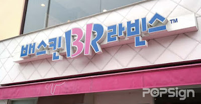
 |
| Caffé Pascucci |
 |
| 7-Eleven |
 |
| Baskin Robbins |
 |
| Dunkin' Donuts |
 |
| Starbucks Coffee |
 |
| Paris Baguette |
 |
| Ministop |
- I'm for them. They look pretty. It's just a lot of those signs need to change the font...
- It's because of the font that makes them look out of place but some of them look okay
- I think it looks so cute. Look at how adorable Dunkin' Donuts in Hangul looksㅜㅜ
- It'd actually be nicer if there were more Hangul signs just for some of the elderly who can't read English
- I don't think it looks nice or anything but the purpose behind it is clear! There are people who might not be able to read English so it's good to write it in Korean too...
- The English ones look better. Starbucks' looks so ugh..
- I freaking love it. You gotta make it Korean~~~ there's people who don't know English, kids, elderly, the point is so that we know what the name of the store is right? I mean we're in Korea ㅋㅋㅋ I wish all of the signs were in Korean
- What's up with the designs
- I like it a lot! Where else are you going to use Korean signs other than in Korea? ㅜ ㅜ On the contrary there should be more of these!!!
- Honestly I don't know how to pronounce new brands that I see so I like this plus isn't this one of Insadong's unique characteristics?


0 comments:
Post a Comment